Components & Collaboration
One of the main challenges of working on a large and complex product, such as BIM 360, is creating cohesion between the different elements and interactions within the system. This is even more challenging when working on the same product family with design teams located across the globe.
I built this component library in order to organise the different components, and minimise the creation time of design elements. I then shared it with my team, so they could contribute their designs to the library as well.
I found that Figma was the best tool for collaborating and sharing libraries, and so I became a Figma champion. In my efforts to get other designers on board I build components, that were smart and easy to use.
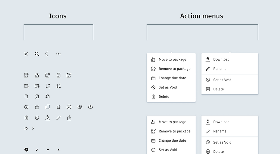
Icons
I started by organising small components, such as icons and menu options. One of the top priorities was giving each component a name that would make it easy for other designers to find and keep the library organised and easy to navigate.
.png)
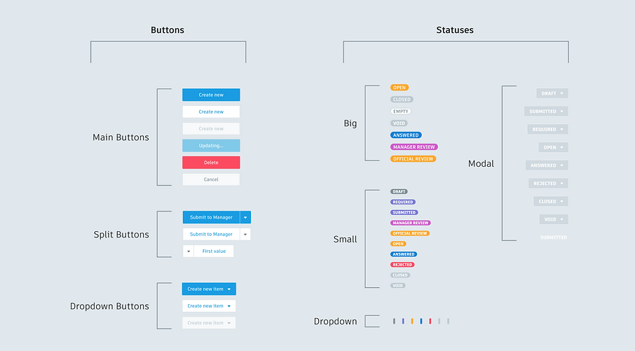
Buttons and Statuses
Another important element was providing all possible button states, such as disabled states, updating and dropdown buttons.
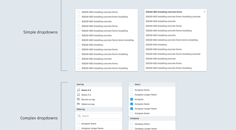
Dropdowns
Many components specifications included different instances with slight alterations. For example, the dropdown component can be customised according to different usability needs, such as single-select, multi-select, icons, search, and sort.
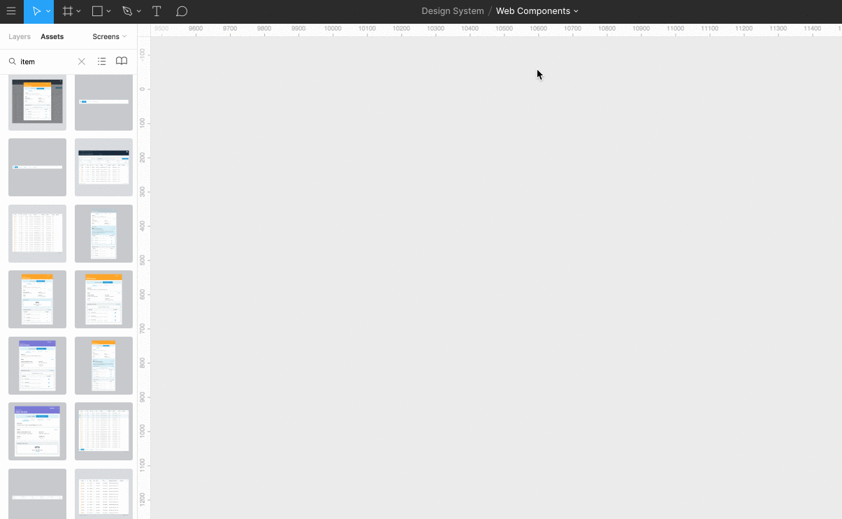
Figma Demonstration
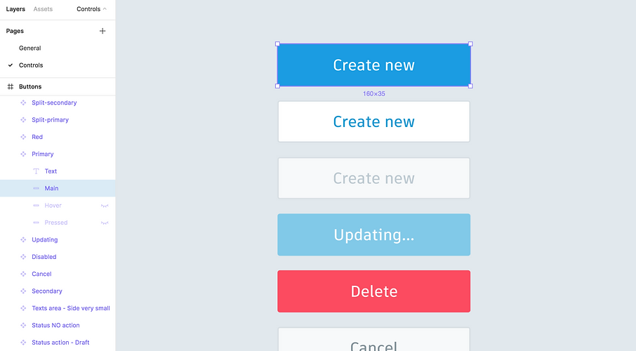
Library components are easily dragged onto the canvas, and can be easily resized or swapped with a different component.
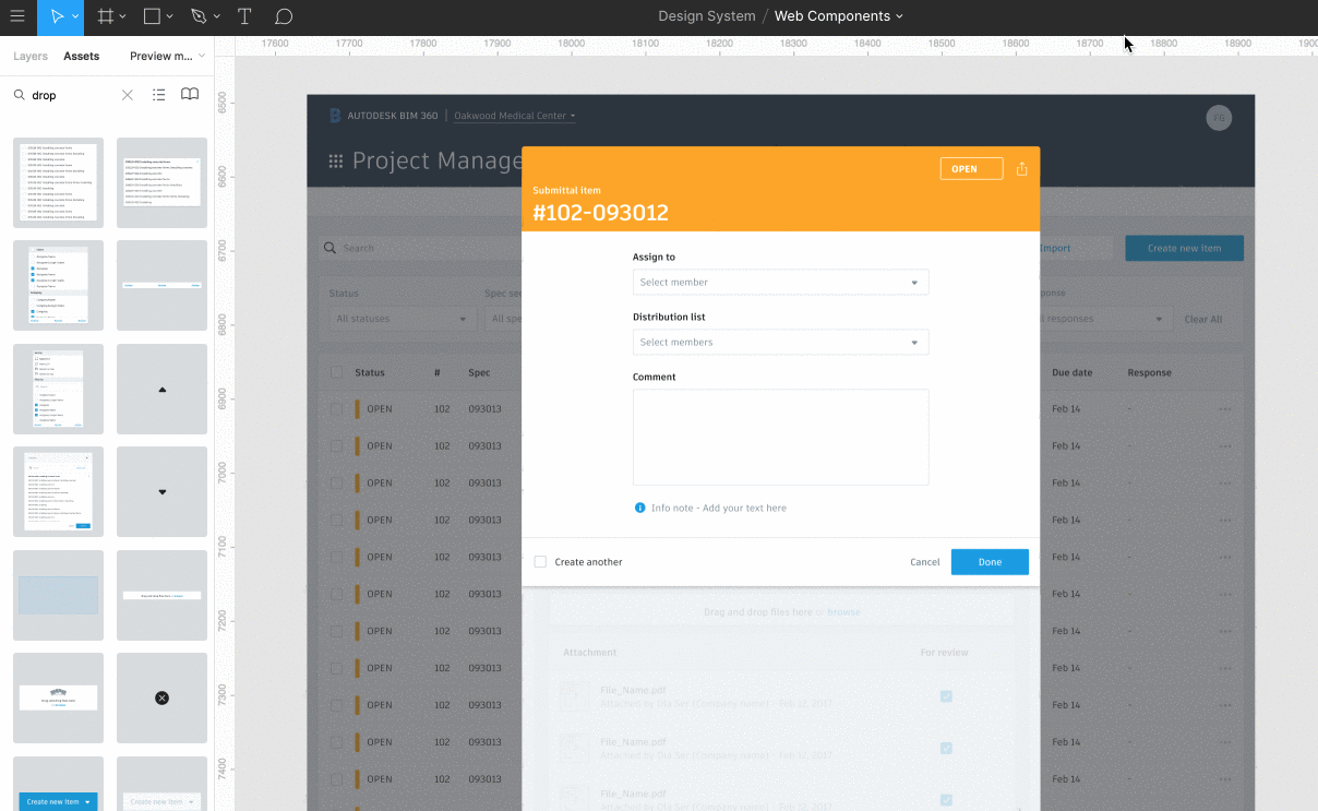
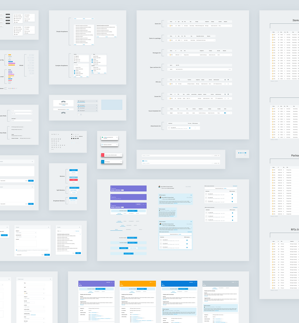
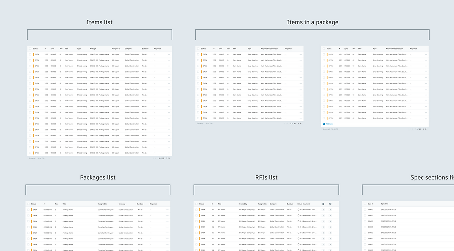
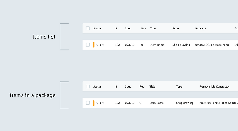
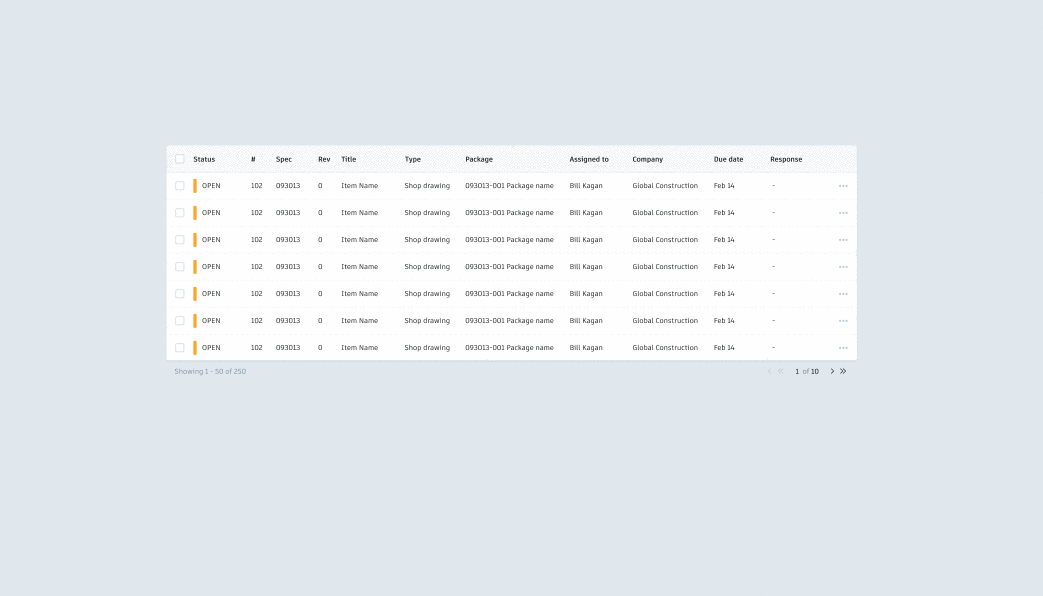
Table Components
I also created larger components, such as tables. This way, if any changes were made to the column order, they could be changed once in the library and updated across the board. Each element was created so it could easily be resized and adjusted
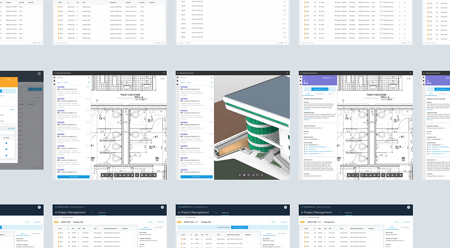
Full Page Templates
Finally, I created full page components. These were especially for large scale changes, such as alterations in panel location on the canvas view, which affect all pages of the product.
Next